2022(FR)
Souffler de son souffle
editorial design | artistic direction | text-image composition | typesetting
︎︎︎ Buy the exhibition catalogue
︎︎︎ Buy the exhibition catalogue
Design of the exhibition catalogue Souffler de son souffle (27.11.21–28.04.22) which gathered 26 artists from different generations and artistic movements at the Fondation Vincent van Gogh Arles (FVVGA).
Book
Curators: Bice Curiger, Julia Marchand, Margaux Bonopera
Editorial coordination: Alice Neurohr
Texts: Margaux Bonopera, Théo Casciani, Brice Curiger, Julia Marchand, Candyce Métévola, Clara Mure
Graphic conception: êkhô studio
Photoengraving: Terre Neuve Arles
Format: 16x22cm
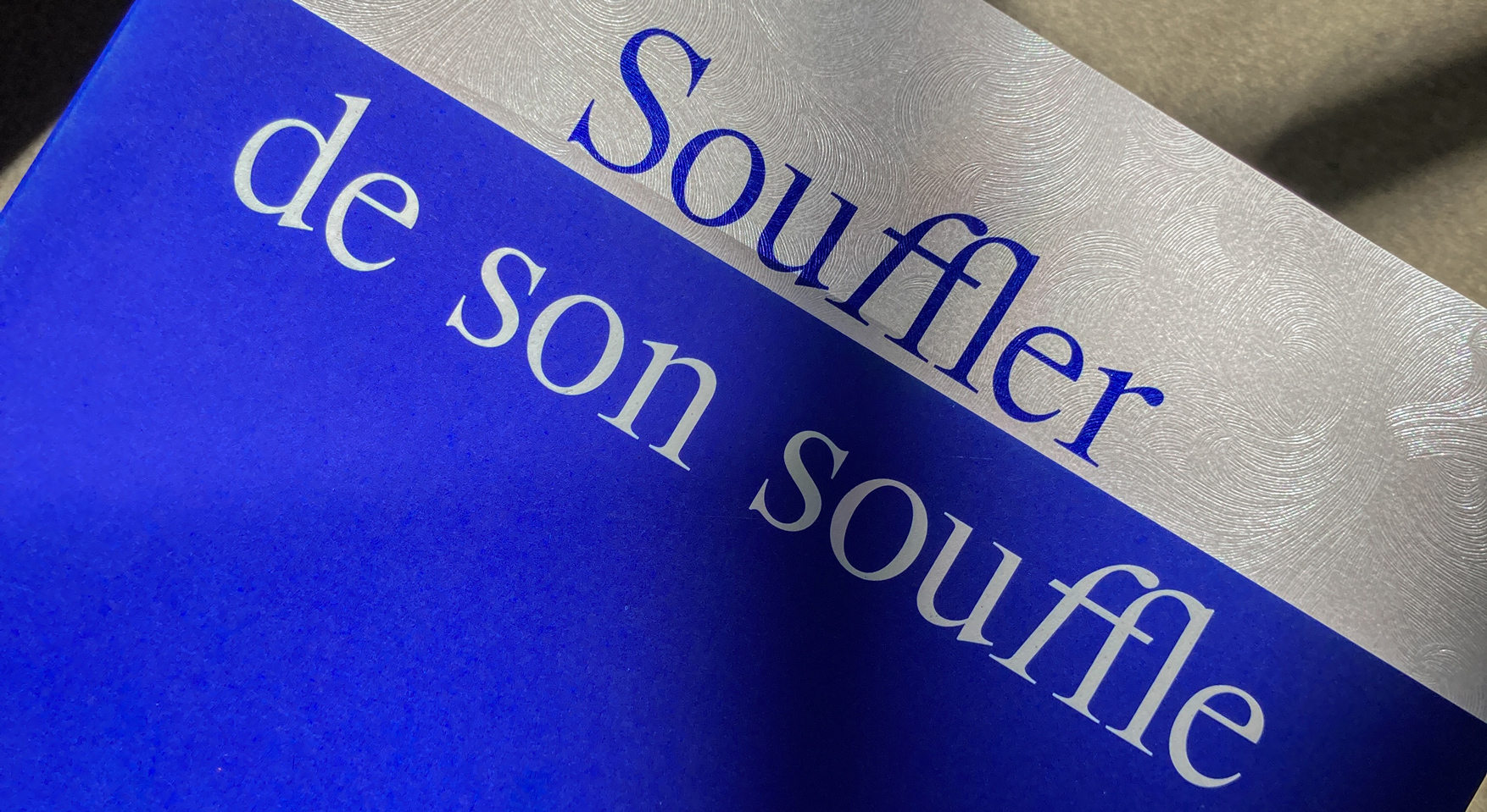
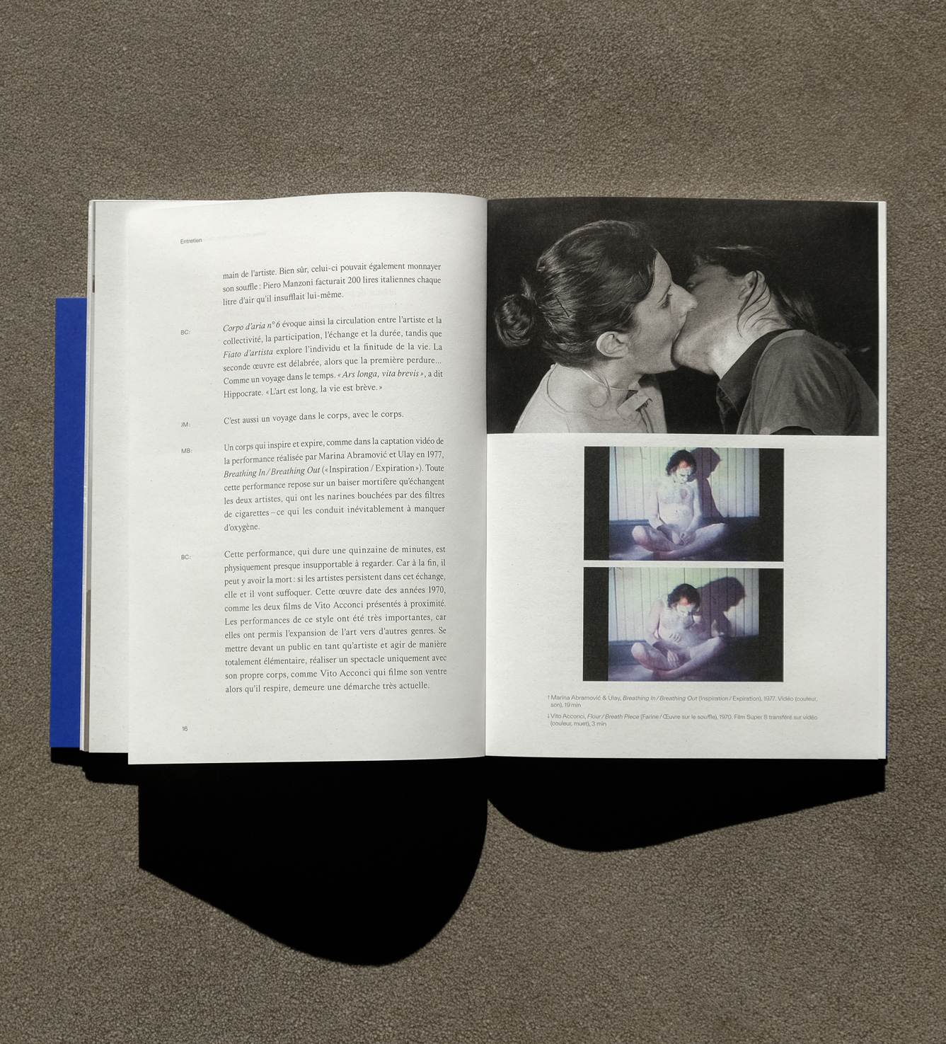
The thematic exhibition “Breathing one’s breath” brings together 26 artists belonging to distinct artistic movements and generations. Taking its title from the words Vincent van Gogh addressed to Emile Bernard “it’s a matter of breathing one’s breath as long as one has breath” the exhibition takes a transhistoric route as it covers all the spaces within the Fondation Vincent van Gogh Arles.
To show the diversity of the non-linear curatorial approach, we worked on a hybrid catalogue with different papers, colors and textures. The publication is divided in five different parts and includes a variety of texts.
To show the diversity of the non-linear curatorial approach, we worked on a hybrid catalogue with different papers, colors and textures. The publication is divided in five different parts and includes a variety of texts.

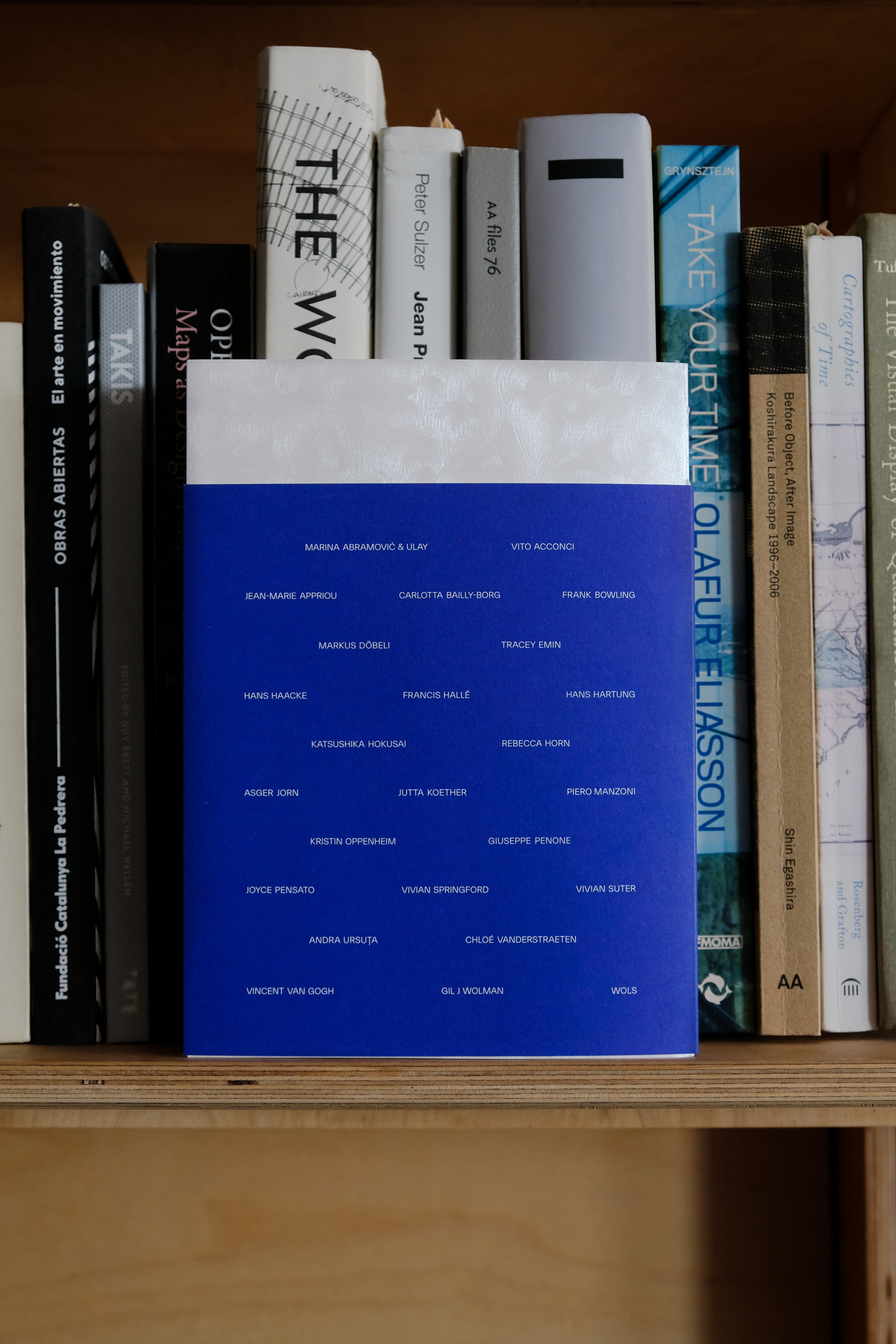
Artists exhibited:
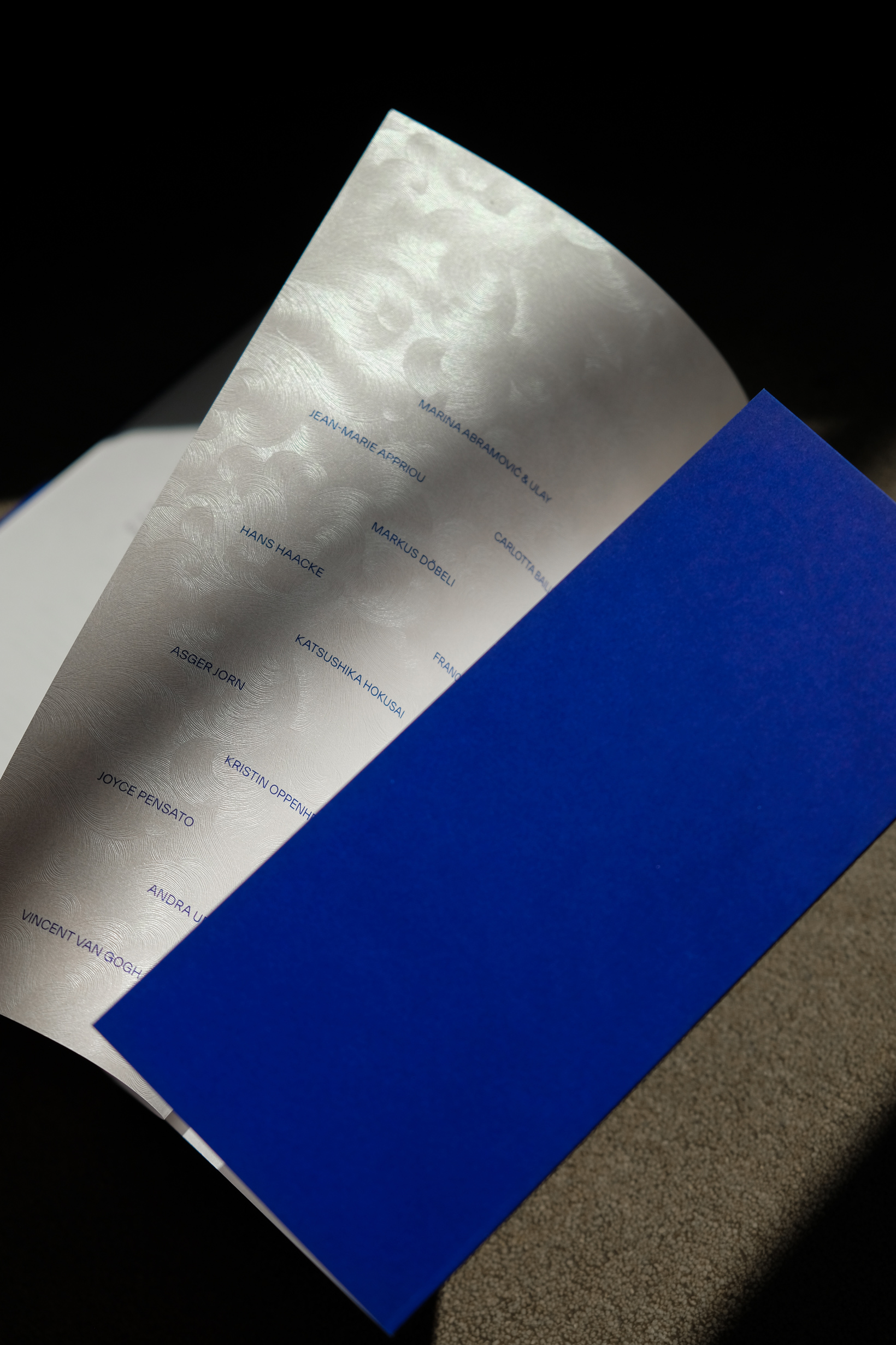
Marina Abramović & Ulay, Vito Acconci, Jean-Marie Appriou, Carlotta Bailly-Borg, Frank Bowling, Markus Döbeli, Tracey Emin,Hans Haacke, Francis Hallé, Hans Hartung, Katsushika Hokusai, Rebecca Horn, Asger Jorn, Jutta Koether, Piero Manzoni,Kristin Oppenheim, Giuseppe Penone, Joyce Pensato, Vivian Springford, Vivian Suter, Andra Ursuta, Chloé Vanderstraeten, Vincent van Gogh,Gil J Wolman, Wols
Artists exhibited:
Marina Abramović & Ulay, Vito Acconci, Jean-Marie Appriou, Carlotta Bailly-Borg, Frank Bowling, Markus Döbeli, Tracey Emin,Hans Haacke, Francis Hallé, Hans Hartung, Katsushika Hokusai, Rebecca Horn, Asger Jorn, Jutta Koether, Piero Manzoni,Kristin Oppenheim, Giuseppe Penone, Joyce Pensato, Vivian Springford, Vivian Suter, Andra Ursuta, Chloé Vanderstraeten, Vincent van Gogh,Gil J Wolman, Wols
Marina Abramović & Ulay, Vito Acconci, Jean-Marie Appriou, Carlotta Bailly-Borg, Frank Bowling, Markus Döbeli, Tracey Emin,Hans Haacke, Francis Hallé, Hans Hartung, Katsushika Hokusai, Rebecca Horn, Asger Jorn, Jutta Koether, Piero Manzoni,Kristin Oppenheim, Giuseppe Penone, Joyce Pensato, Vivian Springford, Vivian Suter, Andra Ursuta, Chloé Vanderstraeten, Vincent van Gogh,Gil J Wolman, Wols
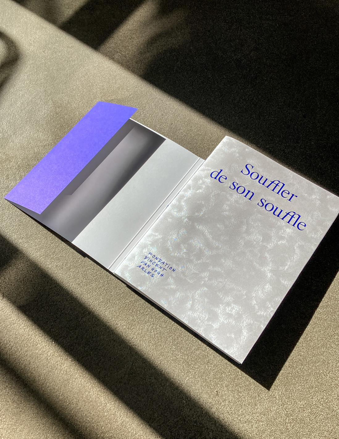
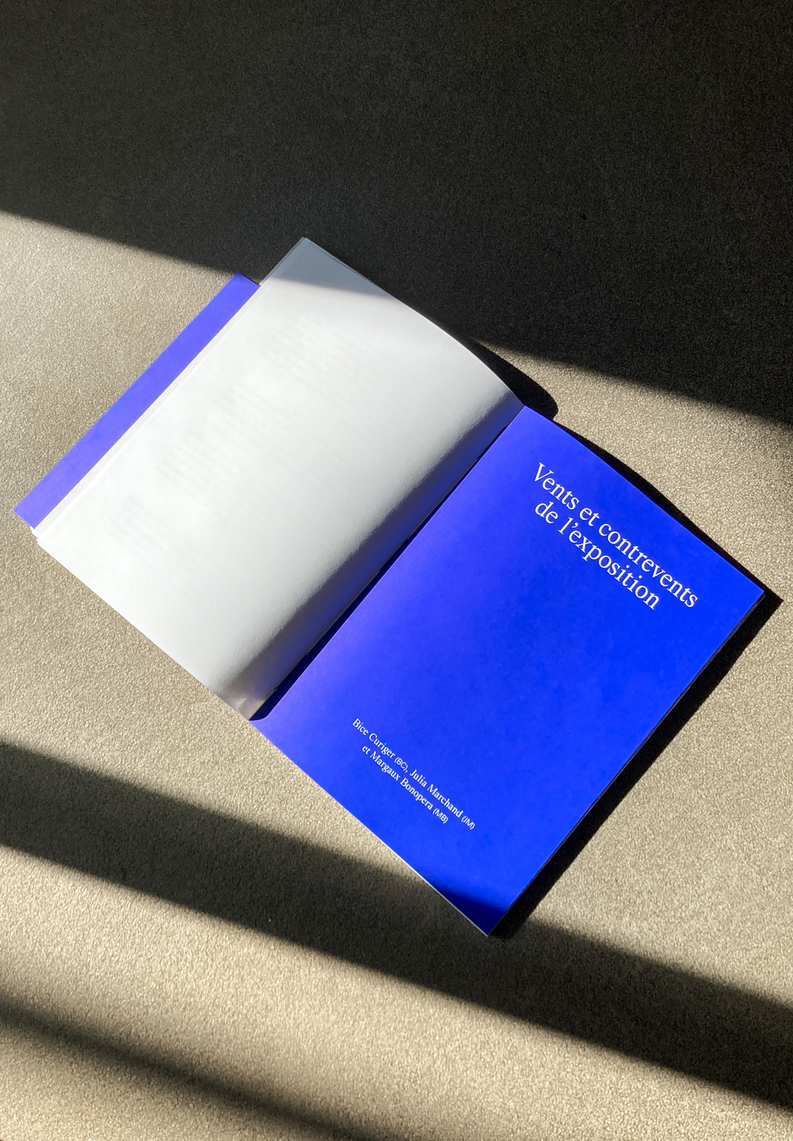
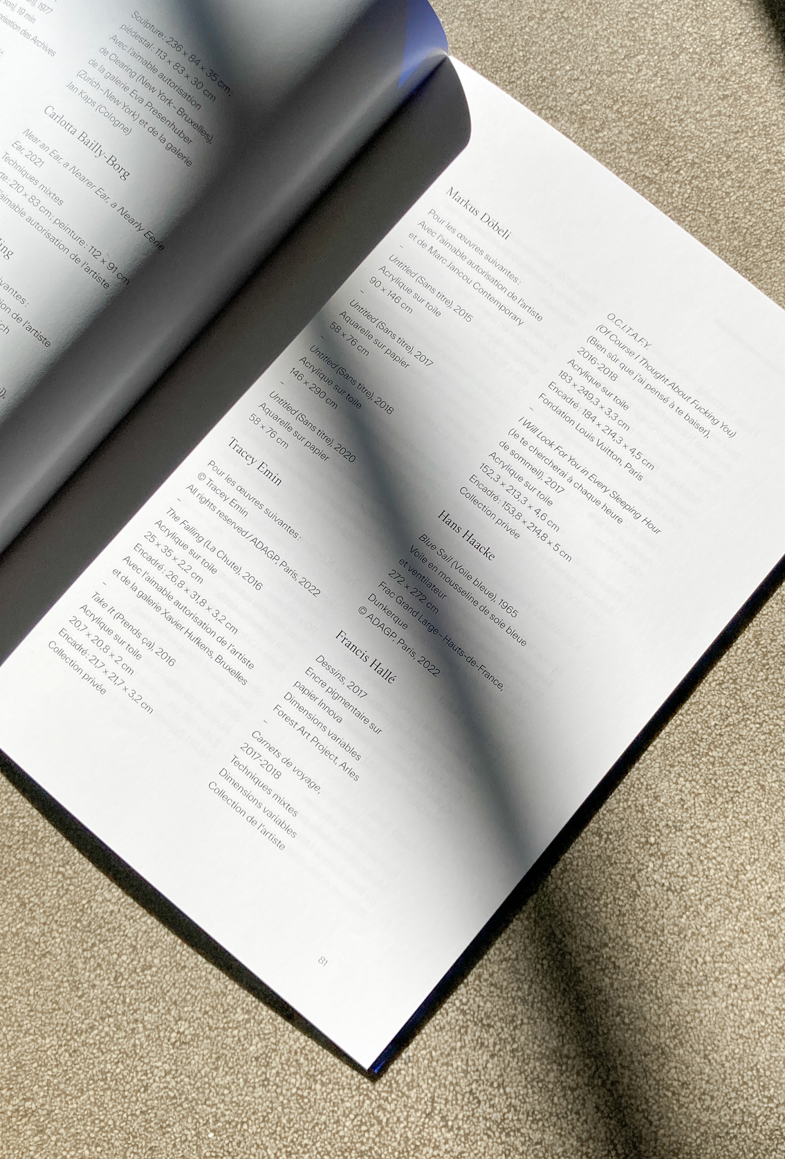
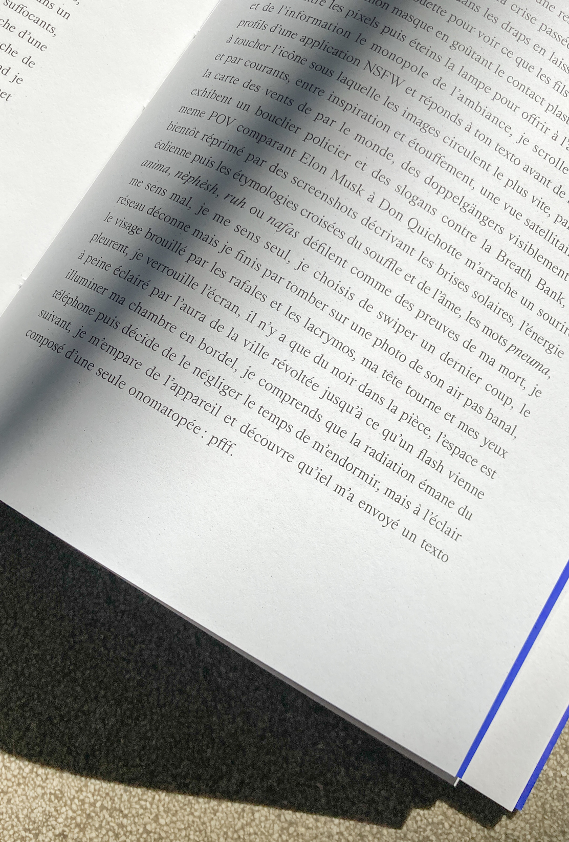
The publication begins with the preface and an interview between curators Bice Curiger, Julia Marchand and Margaux Bonopera. It is followed by a fictional essay by Théo Casciani, Pfff, and a glossary. The catalogue ends with appendices, a list of the artistic works exhibited, biographies of the artists and authors involved, and a final text on the foundation. We have adapted the layout grid to the nature of each text, while separating each category with a blue title page.


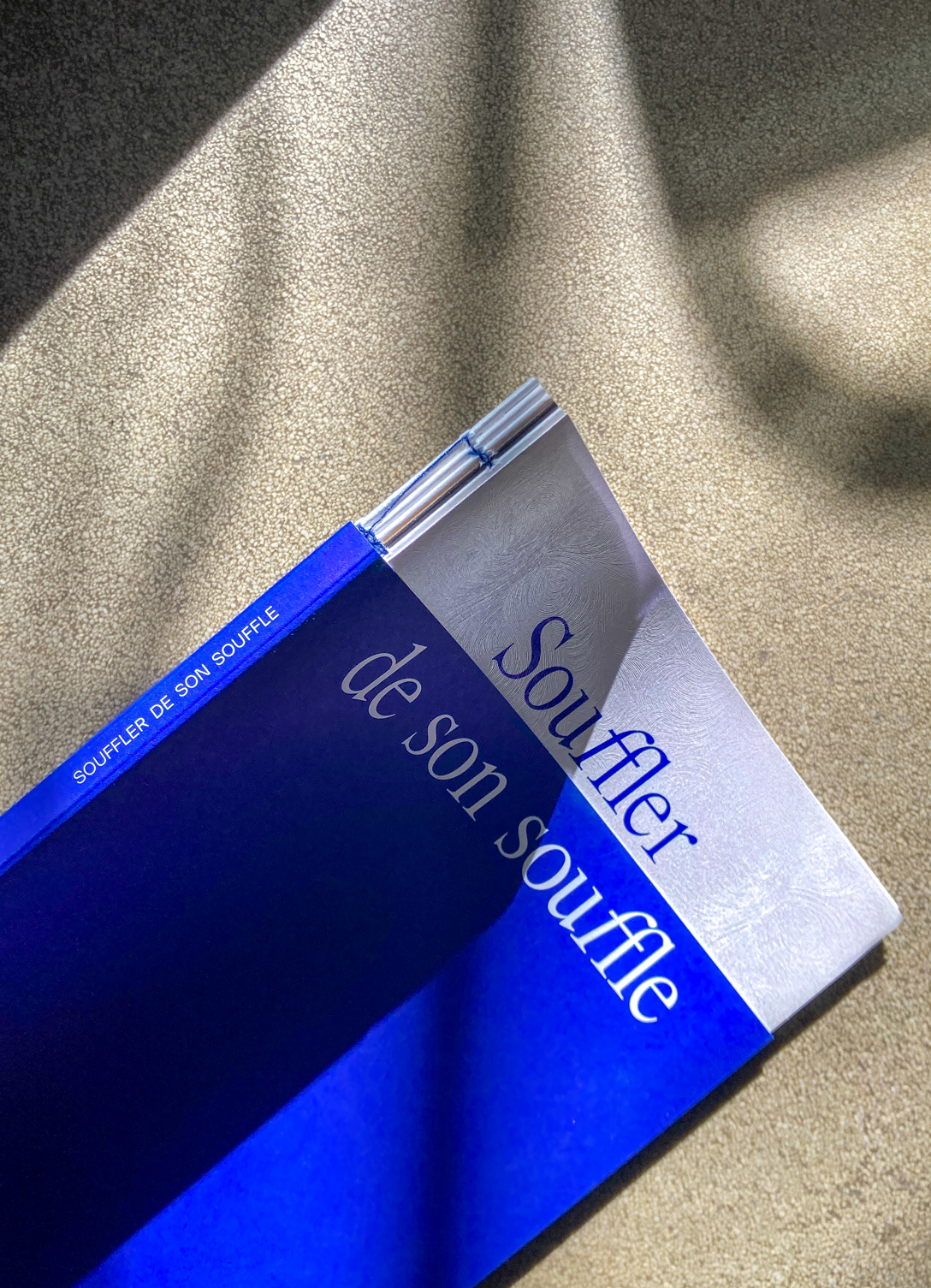
We worked with two complementary fonts: Everett, designed by Nolan Paparelli, and Kormelink, designed by Jacob wise. We played with these two fonts, mainly using Kormelink for the first part of the catalogue, and Everett for the appendices. We've also personalized the word “souffle” throughout the publication, the first 'f' bends over the other 'f' as if a breath makes it change.


We used different textured papers for the cover as well as to separate the different parts of the publication. We played with the architecture of the catalogue itself. The cover has a cut flap to reveal the word "Souffler", and plays between two papers of different thicknesses and colors. Fedrigoni's "jade" paper resembles wind patterns and makes the link with some patterns used by Vincent van Gogh. The binding with blue thread is apparent and shows the various booklets of the catalogue.
The paper for the main part of the publication is coated, specially chosen for photoengraving. Appendices use thinner, glossy paper in an information and magazine register.
The paper for the main part of the publication is coated, specially chosen for photoengraving. Appendices use thinner, glossy paper in an information and magazine register.


© 2024